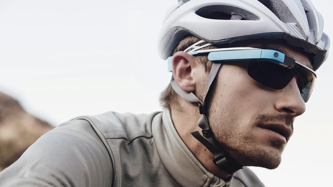
This is the oldest prototype on my playground, and still one of my favorites.
Google Glass had just launched, and Google was looking for use cases. At Adidas, we had miCoach — real-time workout coaching, delivered through audio and the phone. The collaboration question wrote itself: what if your coach lived in the corner of your eye?
We didn't know what we didn't know
Brand-new hardware, brand-new interaction surface, zero conventions to lean on. So before anyone designed anything, the first prototype was this: put the Glass on. Go run. Go ride. See what it's like.
The second move was barely more sophisticated, and it's the one that earned its keep. We loaded a folder of static images onto the Glass — mock data screens at its native 640×360 — and cycled through them like a slideshow, mid-workout. No app. No code. Just JPEGs, worn on a run.
A paper prototype for your face.
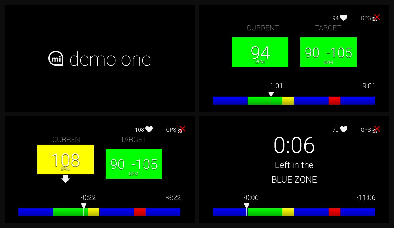
Heart rate against a target zone, elapsed time, pace, zone-transition countdowns — plus screens from other running apps for contrast. The question for every frame: in the middle of a real workout, can you read this? Do you want it? When?
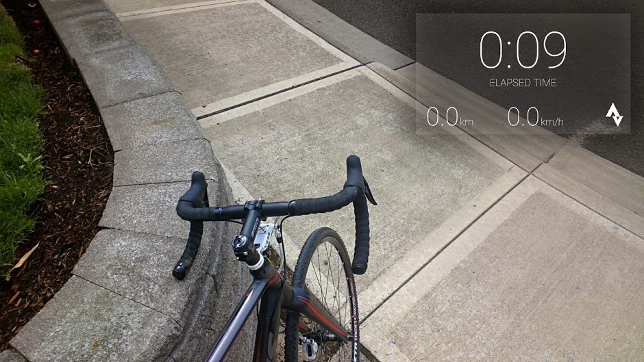
What the runs taught us
Glanceable thrills, then distracts. New information floating in your eye is exciting for about five minutes. Then it starts competing with the road. A constant display was never going to work.
Pull, not push. The fix was interaction: let the runner tap for information and find it fast, instead of feeding it continuously. The screen should sleep until it's wanted.
Except when a coach would speak up. The exception that proved the rule: pace. Too fast, too slow, zone about to change — that's exactly when a real coach interrupts you. Those moments earned a visual wake-up, kept brief enough not to distract.
That became the design spine: the screen wakes on the landmarks of a coached workout and says only what a coach would say — not a dashboard you have to dig through at 7:31 a mile.
The head start
All of this happened before a line of Glass code was written. By the time real design and development started on what became the miCoach Glass app, we already knew the display had to sleep, the runner had to pull, the coach moments had to push, and one dense screen was too many — cycle simple ones instead.
That's what a few JPEGs and a couple of sweaty test runs bought: the shape of the product, for free.
Old prototype, evergreen lesson
The hardware didn't survive, but the method did. Every new surface since — watches, AR, today's AI glasses — starts from the same place: nobody knows the conventions yet, including you.
So before you design, wear the thing. Load it with fakes. Go for a run. The corner of your eye will tell you things a design review never will.